Moskau Pattern
☆☆☆☆☆
(0 reviews)
Lowest price (incl. delivery)
78,00 USD
- Offers
- 1
- Last updated
- 1 lună în urmă
| Vânzător | Product price | Delivery | Total | Disponibilitate | Updated | |
|---|---|---|---|---|---|---|
| Monotype | Product price 49,00 USD | Delivery 29,00 USD | Total 78,00 USD | Disponibilitate Disponibil | Updated 1 lună în urmă | View offer |
Prețurile și disponibilitatea se pot modifica. Ultima actualizare: 19.08.2026 21:49.
0,0
☆☆☆☆☆
0 reviews
5★
0%
4★
0%
3★
0%
2★
0%
1★
0%
Product reviews
No reviews yet — be the first!
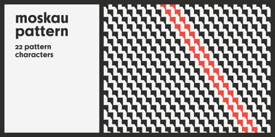
Moskau Pattern Font Family was designed by Björn Gogalla and published by Letter Edit. Moskau Pattern contains 2 styles and family package options. The design of the typeface Moskau Grotesk and Moskau Pattern is based on the signage created for the Café Moskau in Berlin by the graphic artist Klaus Wittkugel in the beginning of the 1960s. The Café Moskau, across from the Kino International on Karl-Marx-Allee in Berlin Mitte was one of the prestige edifices of the former DDR (German Democratic Republic). Built in the early 1960s, it advanced over the years and changing social developments to a trademark building of the capital. The lettering display on the roof was created by the graphic artist Klaus Wittkugel (October 17, 1910 – September 19, 1985). He had been Professor at the School for Applied Arts in Berlin, and, in addition to the creation of many posters, book covers and postage stamps, he was responsible for the signage of the Kino International as well as for the complete graphic treatment for the Palace of the Republik. The signage for the Café Moskau with the words »RESTAURANT«, »CAFÉ«, »KONZERT« and »MOCKBA« set in capital letters, becomes the basis for the Moskau Grotesk which was developed by Björn Gogalla in 2013. This face should not be seen as an imitation. A few shortcomings were »fixed«. In favor of maintaining the core characteristics some unique features were, however, not relinquished. Lower case letters and the missing capital letters were designed from scratch. It is not surprising that the plain, unassuming geometrical direction of the basic character style forms a bridge to the architecture of the 1960s. Inspired by the then favored, diverse possibilities inherent in the architectural example and wall reliefs, two complimentary pattern fonts emerged.