
Trevor
☆☆☆☆☆
(0 opinii)
Najniższa cena (z dostawą)
1 507,00 HUF
Liczba ofert3
Ostatnia aktualizacja1 dzień temu
| Sprzedawca | Cena produktu | Dostawa | Razem | Dostępność | Aktualizacja | |
|---|---|---|---|---|---|---|
| LI Libri.hu | 1 492,00 HUF | 15,00 HUF | 1 507,00 HUF | Dostępny | 2 tygodnie temu | Zobacz ofertę |
| KN Knetbooks.com | 17,88 USD | 19,00 USD | 36,88 USD | Dostępny | 1 tydzień temu | Zobacz ofertę |
| MO Monotype | 35,00 USD | 0 zł | 35,00 USD | Dostępny | 1 dzień temu | Zobacz ofertę |
Ceny i dostępność mogą ulec zmianie. Ostatnia aktualizacja: 19.08.2026 21:51.
0,0
☆☆☆☆☆
0 opinii
5★
0%
4★
0%
3★
0%
2★
0%
1★
0%
Opinie o produkcie
Brak opinii — bądź pierwszy!
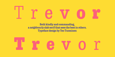
Trevor Font Family was designed by Teo Tuominen and published by TypeTogether. Trevor contains 7 styles and family package options. Teo Tuominen’s Trevor took its first breath as a revival of an 18th century antiqua, but culminated in an entirely new and good-natured family. Trevor is an affable slab serif in nature: both heavy and kind. Known for their familiarity and their dark colour, the terminals of slab serifs put additional weight along the line to maintain an inky presence. Their clunky forms reveal slight immaturity and arouse the reader’s sympathy for the subject at hand. Trevor connects with others by consciously riding the line between being personal and commanding. One goal with Trevor was to pair the robust nature of a low contrast slab serif with more sophisticated elements, such as the ball terminals. So wherever one looks in Trevor, rounded corners rule the day, softening the overall appearance by mimicking ink spread made by old metal type. The easygoing look is tempered by very few inktraps and sharp corners, mostly to the inside of characters and in acute angles. Whatever Trevor is paired with, it has an altruistic outlook in that it sees the best in others. It’s the neighbourly type family — the neighbour you actually want. Trevor’s almost monolinear weight and high x-height give it a typewriter look in the extralight and light weights, but the whole family was made to work with many other font styles, design work, and information structures. It certainly finds its home in packaging and advertising, its sturdy verticality and narrowness fit the needs of headlines and intro text, and its seven weights are primed for plays and involved text needing many layers of distinction. The black weight is treated like a separate display style with altered ball terminals and serifs to capitalise on the added heft. Trevor’s seven roman weights cover the Latin A Extended glyph set to bring its kindly and commanding outlook to your projects. Along with alternate version of the ‘R’ in the black weight, its OpenType features include both tabular and proportional lining and oldstyle figures, ligatures, and fractions. The complete Trevor family, along with our entire catalogue, has been optimised for today’s varied screen uses.
Podobne produkty
 Sustainable Development
od $2,281.25
Sustainable Development
od $2,281.25
 Author Title and Subject Guide
od $1,780.26
Author Title and Subject Guide
od $1,780.26
 Debating Issues in American Education
od $825.02
Debating Issues in American Education
od $825.02
 Karl Popper
od $1,978.07
Karl Popper
od $1,978.07
 Encyclopedia of Journalism
od $1,058.62
Encyclopedia of Journalism
od $1,058.62
 NUR 110 Print+Ebook Bundle
od $1,908.35
NUR 110 Print+Ebook Bundle
od $1,908.35
 GMR Springfield Paramedic 9E Flipped Bundle Updated .
od $1,382.58
Nursing Volume 1 & 2 with Clinical Nursing Skills Volume 3 & MyNursingLab Package
od $1,183.17
GMR Springfield Paramedic 9E Flipped Bundle Updated .
od $1,382.58
Nursing Volume 1 & 2 with Clinical Nursing Skills Volume 3 & MyNursingLab Package
od $1,183.17