Retiro Std
☆☆☆☆☆
(0 opinii)
Najniższa cena (z dostawą)
72,00 USD
- Liczba ofert
- 1
- Ostatnia aktualizacja
- 1 miesiąc temu
| Sprzedawca | Cena produktu | Dostawa | Razem | Dostępność | Aktualizacja | |
|---|---|---|---|---|---|---|
| Monotype | Cena produktu 72,00 USD | Dostawa 0 zł | Razem 72,00 USD | Dostępność Dostępny | Aktualizacja 1 miesiąc temu | Zobacz ofertę |
Ceny i dostępność mogą ulec zmianie. Ostatnia aktualizacja: 19.08.2026 21:51.
0,0
☆☆☆☆☆
0 opinii
5★
0%
4★
0%
3★
0%
2★
0%
1★
0%
Opinie o produkcie
Brak opinii — bądź pierwszy!
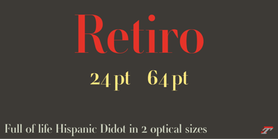
Retiro Std Font Family was designed by Jean François Porchez and published by Typofonderie. Retiro Std contains 2 styles and family package options. Full of life Hispanic Didot in 2 optical sizesRetiro is a daring interpretation of Spanish typography. Severe, austere and yet, full of life, Retiro is a vernacular version of Castilian and Andalusian in a typical Didot. Named after a lovely park in Madrid, Retiro started life as a a bespoke typeface designed to give a unique voice to the magazine Madriz. In 2006, the founder of Madriz was looking for a Didot for his new magazine. The Didot is the archetypal typeface used in high-end magazines. Retiro is a synthesis of these high contrast styles mixed with an Hispanic mind. Result is then, after 2-3 years of work, a typeface with countless variations to establish typographic shades adapted to different sections and pages of the Madriz.In 2014, it was necessary to further revise the typeface before its launch at Typofonderie. In order to keep its originality, the unique weight was retained, but complemented with optical size variants to set highly contrasted headlines into various sizes, visually balanced.How to use Retiro optical sizes?Each font provided in Retiro family is named according to the scale of body size: 24 pt and 64 pt. Of course, these names are referring to the body sizes used in typographic design. In the “glorious old days,” the letterpress period, it was customary to cut punches directly to the size at which typefaces would be used. The punchcutter had to visually adapt his design to the engraving size. The aim was to optimize the best contrast and general weight, but also to respect both design’s and reader’s needs. In Retiro’s case, intended for large titling sizes, it’s an adaptation of this ancient practice for our contemporary uses.Although each font is named by a typographic point size, do not feel obliged to use this font at this precise size, but why not, in larger or smaller. It’s rather the concept of gradients that must be preserved in layouts, rather than strictly size numbers. It’s up to the designer to select the right font size for his own designs.Granshan Awards 2012Creative Review Type Annual 2011Designpreis 2011Club des directeurs artistiques, 41e palmarèsType Directors Club 2010 Certificate of Type design Excellence