Optima
☆☆☆☆☆
(0 opinii)
Najniższa cena (z dostawą)
60,99 USD
Liczba ofert2
Ostatnia aktualizacja1 miesiąc temu
| Sprzedawca | Cena produktu | Dostawa | Razem | Dostępność | Aktualizacja | |
|---|---|---|---|---|---|---|
| Monotype | Cena produktu 45,99 USD | Dostawa 15,00 USD | Razem 60,99 USD | Dostępność Dostępny | Aktualizacja 1 miesiąc temu | Zobacz ofertę |
| Wayfair North America | Cena produktu 250,00 USD | Dostawa 15,00 USD | Razem 265,00 USD | Dostępność Dostępny | Aktualizacja 1 miesiąc temu | Zobacz ofertę |
Ceny i dostępność mogą ulec zmianie. Ostatnia aktualizacja: 19.08.2026 21:51.
0,0
☆☆☆☆☆
0 opinii
5★
0%
4★
0%
3★
0%
2★
0%
1★
0%
Opinie o produkcie
Brak opinii — bądź pierwszy!
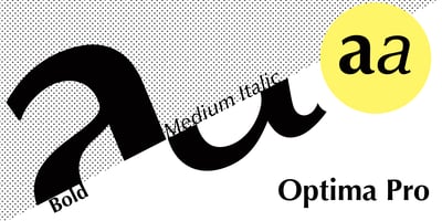
Optima Font Family was designed by Hermann Zapf and published by Linotype. Optima contains 12 styles and family package options. Many typefaces are distinctive or attractive at the expense of legibility and versatility. Not so the Optima® family. Simultaneously standing out and fitting in, there are few projects or imaging environments outside of its range. Although Optima is almost always grouped with sans serif typefaces, it should be considered a serifless roman. True to its Roman heritage, Optima has wide, full-bodied characters – especially in the capitals. Only the E, F and L deviate with narrow forms. Consistent with other Zapf designs, the cap S in Optima appears slightly top-heavy with a slight tilt to the right. The M is splayed, and the N, like a serif design, has light vertical strokes. The lowercase a and g in Optima are high-legibility two-storied designs. Optima can be set within a wide choice of line spacing values – from very tight to very open. In fact, there are few limits to the amount of white space that can be added between lines of text. Optima also benefits from a wide range of letter spacing capability. It can be set quite tight, or even slightly open – especially the capitals. If there are any guidelines, Optima should be set more open than tight. It’s not that readability is affected that much when Optima is set on the snug side; it’s just that the unhurried elegance and light gray typographic color created by the face are disrupted when letters are set too tight. Optima is also about as gregarious as a typeface can be. It mixes well with virtually any serif design and a surprisingly large number of sans serif faces. The Optima family is available in six weights, from roman to extra black, each with an italic counterpart. In addition, the family is available as a suite of OpenType® Pro fonts, providing for the automatic insertion of small caps, ligatures and alternate characters, in addition to offering an extended character set supporting most Central European and many Eastern European languages. When you’re ready to find its perfect pairing, browse these fantastic matches: Monotype Century Old Style™, Dante®, Frutiger® Serif, Joanna® Nova, Malabar™ and Soho®.