FS Hackney
☆☆☆☆☆
(0 reviews)
| 판매자 | Product price | Delivery | 합계 | 재고 여부 | Updated | |
|---|---|---|---|---|---|---|
| Monotype | Product price 80,00 USD | Delivery free | 합계 80,00 USD | 재고 여부 구매 가능 | Updated 1개월 전 | View offer |
가격과 재고 여부는 변경될 수 있습니다. 마지막 업데이트: 19.08.2026 21:51.
0,0
☆☆☆☆☆
0 reviews
5★
0%
4★
0%
3★
0%
2★
0%
1★
0%
Product reviews
No reviews yet — be the first!
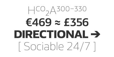
FS Hackney Font Family was designed by Nick Job and published by Fontsmith. FS Hackney contains 10 styles and family package options. EllipticalThe squareness of curves. That was the elliptical – in more than one sense – notion being explored in the making of FS Hackney. The squareness of curves and vertical terminals to create a gentle, soft sans serif, with a little bit of magic.A momentary thought – “It doesn’t have to be like this” – provided the spur to explore the verticals and skeletons of letterforms beyond conventional type design limits. A 12-month gestation period gave rise to a font with a larger-than-usual character set, including non-lining figures, small caps and superior and inferior numbers. It’s a collection that speaks confidently for itself.AssertiveIt was the Hackney carriage – the black London cab – that gave this font its name, not the north London neighbourhood. Solid, dependable, effective and built to last, FS Hackney was honed to perform in all conditions. Cool, compelling lines and a satisfying overall simplicity lend FS Hackney its assertive air. Assured, versatile and effective; just like a black cab (but without the grumbling).MachinedOver a string of meetings, Jason Smith and FS Hackney designer Nick Job worked out how to infuse Nick’s sketched letterforms with Fontsmith’s familiar geniality.“Nick is very meticulous and produces very clean design work,” says Jason. “Hackney is ideal for branding as it’s very clear and its quirks are sensible ones, not odd ones, that don’t distract from the message.”