Alizé
☆☆☆☆☆
(0 reviews)
Lowest price (incl. delivery)
78,00 USD
- Offers
- 1
- Last updated
- 2개월 전
| 판매자 | Product price | Delivery | 합계 | 재고 여부 | Updated | |
|---|---|---|---|---|---|---|
| Monotype | Product price 49,00 USD | Delivery 29,00 USD | 합계 78,00 USD | 재고 여부 구매 가능 | Updated 2개월 전 | View offer |
가격과 재고 여부는 변경될 수 있습니다. 마지막 업데이트: 19.08.2026 21:51.
0,0
☆☆☆☆☆
0 reviews
5★
0%
4★
0%
3★
0%
2★
0%
1★
0%
Product reviews
No reviews yet — be the first!
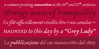
Alizé Font Family was designed by Tom Grace and published by TypeTogether. Alizé contains 3 styles and family package options. Alizé is a three-weight typeface inspired by the chancery italic of the 16th century. It is a high-contrast face, created with syncopations in axes and proportions and subtle irregularities that form a lively and delicate weave, suitable for setting a single word, a special expression, or a short block of prose. The family does not contain a roman, and instead promotes the italic as a primary style, a common printing convention in the 16th and 17th centuries. The italic lowercase predates inclined capitals by about twenty years, and as a nod to this typographic evolution, Alizé’s capitals, small capitals, and figures are very slightly inclined to match the energy of the lowercase. The low x-height and long ascenders and descenders, features associated with finesse and luxury, are reminiscent of the Venetian-style italic, but are further emphasised. Unlike the Venetian italic, however, Alizé has a sharp slope, giving a prominent sweep across the page (alizé is the name of trade wind). Each font of Alizé has a character set count of exceeding 700, and contains an abundance of ligatures, dynamic fractions, ornaments, and pan-European language support. They have also been manually hinted for the highest-quality display on both print and screen.