Surveyor
☆☆☆☆☆
(0 reviews)
Lowest price (incl. delivery)
333,00 USD
- Offers
- 1
- Last updated
- před 2 měsíci
| Prodejce | Product price | Delivery | Celkem | Dostupnost | Updated | |
|---|---|---|---|---|---|---|
| Monotype | Product price 314,00 USD | Delivery 19,00 USD | Celkem 333,00 USD | Dostupnost Dostupné | Updated před 2 měsíci | View offer |
Ceny a dostupnost se mohou změnit. Naposledy aktualizováno: 19.08.2026 21:51.
0,0
☆☆☆☆☆
0 reviews
5★
0%
4★
0%
3★
0%
2★
0%
1★
0%
Product reviews
No reviews yet — be the first!
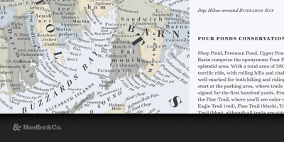
Surveyor Font Family was designed by Jonathan Hoefler and Tobias Frere-Jones and published by Hoefler & Co.. Surveyor contains 60 styles and family package options. Engraved maps use a characteristic form of lettering that’s unmistakable as anything else. We celebrate this style with Surveyor, a monumental family of typefaces designed for print and screen, and for sizes large and small. The Surveyor typeface was designed by Jonathan Hoefler and Tobias Frere-Jones in 2001. It is modeled on a style of engraved lettering first used by British mapmakers in the early nineteenth century, notable for its intensely sloped and flowing italic. Known to signpainters as the ‘stump style,’ these letterforms are representative of a movement in lettering known as the English Vernacular, which before Surveyor went unrepresented in typography. Surveyor was created for Martha Stewart Living, in whose pages the typeface first appeared in 2002. From the desk of the designer: The style of lettering that inspired Surveyor is an invention of the early nineteenth century, born of the material properties of copperplate engraving and the informational needs of cartography. A letter with compact proportions, delicate serifs, and a sinewy italic designed to follow rivers and coastlines, map lettering invited endless variation to help distinguish different kinds of data. A map that used italics for rivers and canals might use its roman for churches and villages, small capitals for bays and harbors, and a grand, sweeping arc of italic swash capitals for the names of the oceans. Inch for inch, few things have ever matched engraved maps for the density of their information, the range of their typographic vocabulary, or their pure visual delight. We’ve always loved maps for their functional and aesthetic properties, and have long wanted to explore their lettering as a family of typefaces. The opportunity arose in 2000, when we were asked by Martha Stewart Living to design for the magazine a custom typeface, as a roman and italic in a single weight. Their brief resonated with what we saw in maps: text with a warm and inviting voice, with the charm of the handmade but the credibility of a textbook, and the functional ability to master many kinds of demanding content at small sizes — including the magazine’s recipes, calendars, step-by-step instructions, and all manner of diagrams. For Living, we created Surveyor in three sizes: Text for body copy, Display for headlines, and Fine for use on the cover. In the ensuing thirteen years, we’ve continued to push the design into new territories, expanding its original weight into a set of five, from a dulcet Light to a roaring Black. Each style now features both roman and italic small caps, and in the text range, a set of tabular figures, extended symbols, and fractions. Swash caps and small caps are managed by an OpenType feature, which we’ve designed to automatically insert or remove swashes based on their context, helping avoid awkward collisions and improve the rhythm of text.